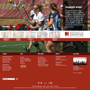
 Nick Denardis of EDU Checkup critiqued the University of Denver’s redesign and gave it a 94%. Pretty good. He liked the strong visual impact of the homepage, that content was geared toward addressing student needs and that the underlying code was done with SEO and accessibility in mind. What Nick didn’t know, couldn’t know, was the drama and politics that culminated in this particular design. One aspect of this hidden world is what I’d like to discuss today- the tension between the marketing and usability camps. While I’d like to think that both can (should) co-exist to support one another, its been my experience that they don’t. An organization tends to lean one way or another, many times leaning so heavily one way or another that the overall site experience suffers and, therefore, so do visitors.
Before we dive into the details, we need to define marketing and usability. By “marketing” I mean a perspective that exults the intangible- largely subjective areas like branding and visual aesthetics. By “usability” I mean a perspective that exults the tangible- things that are perceived to be objective through testing and measurement like navigation and functionality controls, categorization and flow of information. I realize you may disagree on my definitions, but for the sake of argument, I’m not here to say one is better than the other so feel free to change the definitions in your own mind. I support both as I’ve defined them. You should ensure that your visitors are represented through testing and measurement, but you also need to be a leader sometimes and do what you feel is necessary even if it’s contrary to user’s wishes. The two can work in tandem, but so often fail to do so. However, that is not a recipe for disaster in and of itself.
A higher ed site could go in either direction. DU’s homepage is squarely in the marketing corner while the task of finding degree information is squarely in the usability corner, yet neither truly works as intended for me, not to disrespect Nick’s conclusions. The homepage does indeed have impact and bucks the usual higher ed trend, but does it work? It does if you want to grab attention and differentiate yourself from the pack (I’ll assume a prospective undergrad student audience). But do students want different or do they want ease of use or a sense of what life at DU is like or something else? Is the leadership inherent in publishing such a bold homepage good or bad? I’d argue that the homepage misses the mark.
I don’t see any reason to be bold here when so much of our own research and those of DU’s consultants over the years points to the fact that people researching what college to attend are more interested in getting the four big questions answered as opposed to being “marketed” to:
- Does the school offer the degree I’m interested in?
- Am I qualified to attend this school?
- Will I fit in socially/do I see myself being happy at this school?
- Can I (and/or my folks) afford it?
How many of these does the DU homepage answer (or how many of these questions can you easily get to if you make your way to an internal page within the DU site)? To varying degrees, there are links and clues for each of them, but they’re overwhelmed by the gigantic photo and audience links. This page is more about DU than it is about DU’s customers.
UPDATE 4/29/2010: I decided to expand on this idea using a non-higher ed example.