
Atomic Design “…introduces a methodology for thinking of our UIs as thoughtful hierarchies…” writes Brad Frost.
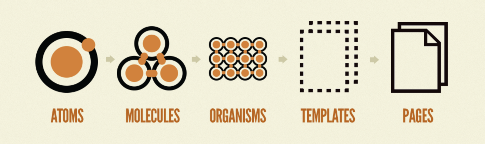
His system begins with atoms, the smallest documented units — think buttons, typographical styles, and the like. Combining atoms together creates a molecule. Multiple molecules and/or atoms in combination form an organism, and so on up the hierarchy. Any atom will likely have variations within the system. A button may offer a few sizes and color, for example, in order to satisfy a range of situations. This is fine as the limited set of options is manageable and come with rules of use.
The advantages of this system are clear: It improves usability and productivity by regulating use. There’s a problem though. When multiple atoms and molecules (each having a set of variations) are combined into an organism, the number of permutations can explode causing strain on the system’s ability to regulate use. When rules begin to fail us, what can we do? We can turn to principled norms. Let’s consider an example.

Here are two card organisms. They’re organisms because they’re made up of atoms and molecules. Both have a header molecule consisting of an icon, header text, and subhead text. They both have content, the one on the left showing a repeating photo/text molecule while the other showing a grid of icon and label molecules. Let’s now pose this question: should these two cards be cataloged as two separate organisms in the design system, or as one with enough variation to produce the two examples shown? I’d say the latter is the best option. Both are the same organism. They only vary in content — in this case, content made of different molecules and atoms.
Now, let’s consider each card’s spacing, with particular attention to the bottom of the cards. Both show a buffer (highlighted in green above) between the card’s content and the edge of the card. Note that the amount of buffer differs (and, indeed, the buffer differs both in real and perceptual terms).


If we examine the structure of how these cards are built by drawing boundaries around content elements, we see that both card organisms (shown in red) have equal amounts of margin and padding along the bottom of the card. The content elements however, don’t. On the left, we see the screenshot/text molecule has no padding and only a top margin to separate it from the molecule above. On the right, the icon/text molecule is padded all around with no margin. We conclude that the cards are identical and any difference you may perceive in the spacing of elements is caused by the variation in content.

This difference is the slippery slope. The card organisms—which are identical—show different visual spacing, an issue a design system is supposed to manage away by automatically introducing consistency as a prime value. The number of ways that atoms, molecules and organisms interact with one another causes an explosion of variation that cannot be fully managed by a simple set of rules.
The Issue in a Nutshell
The dilemma is this — a design system breaks down because the number of variations becomes so large, rules can’t hope to cover every conceivable situation. And you can’t continue to heap on more rules because the system will collapse under its own weight.
The way out is to keep a design system sane by placing more emphasis and effort on the lower level of Frost’s atomic hierarchy. Rules at the higher levels risk paralyzing product teams and bloating design systems to the point of losing their value.
Norms, Not Rules
Again, I don’t want to suggest that design systems are bad — they’re not. I only raise the spectre of too much specificity at higher levels. Instead of rules, I propose norms. Let the collective experience and leadership in the team set what’s acceptable and what’s not. Is that a slippery slope, too? Most definitely, but it acknowledges the fact, rather than masking it. Good designers don’t value from a prescriptive design system at the higher component levels. They need guidance and influence where rules no longer suffice.
One clear tradeoff that shouldn’t go unspoken is that fewer rules lead to more variance, which leads to greater maintenance cost. It won’t be as easy to make one change and have it cascade across the ecosystem. But I’m reminded of Tesler’s Law:
“Every application must have an inherent amount of irreducible complexity. The only question is who will have to deal with it.”
The ‘who’ in this quote is either the business or the user. I’d argue the correct answer in this case is the business — and more specifically, the design system curators (sorry to add work to your plates!).
With design systems being all the rage these days, I feel a word of caution is in order: let’s not slip into a world where we optimize for the design system and, by extension, the business, rather than app designers and, by extension, the business’ users. The way out is to keep a design system sane by placing more emphasis and effort on the lower level of Frost’s atomic hierarchy. Rules at the higher levels risk paralyzing product teams and limiting a design system’s value and promise.
Masthead image courtesy Kai Stachowiak