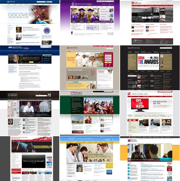
I decided to head over to eduStyle to check out all the site redesign submissions I’ve missed over the last few months. It turns out that “differentiation” doesn’t seem to be a marketing objective anymore. Check out all these variation on a theme (and there are plenty more I could have chosen). What gives? Have we as an industry actually hit upon higher ed’s perfect website layout- big image/interactive area across top with multiple columns of text and images below?
