Book Notes: Playful Design

Here are some highlights I took from John Ferrara’s book Playful Design: Creating Game Experiences in Everyday Interfaces.

The elements of great game UX

  • Motivation: There needs to be a reason to play, a goal.
  • Meaningful choices: You need to be able to influence the outcome of the game through your choices. Partial ambiguity can work well here (eg. I don’t know what will happen if I do X, but I’ll take the chance because I have a reasonable expectation of what will happen).
  • Balance: How well do aspects of the game work together to create an experience where the whole is greater than the sum of the parts?
  • Usability: Interactions must work well. There should be clarity around why you win or lose.
  • Aesthetics: It has to look good to be enticing and engaging enough to bother with.
  • Fun: Of course games are fun, but you can’t create fun. It’s a result of the other factors being successful.

What motivates people to play games?

  • Immersion: Getting lost in another world where you lose track of time (“flow”)
  • Autonomy: The freedom to do whatever you want versus the constraints that come with real life.
  • Competence: People like the feeling of being good at something and games give them that chance.
  • Catharsis: Blowing off steam that you wouldn’t otherwise be able to do in real life.
  • Accomplishment: Risk vs. reward. Games allow you a safe place to strive for greatness.
  • Social image: A belief that if you’re good at something, people will have a more favorable impression of you.
  • Social interaction: Games are an outlet to socialize with others.
  • Creativity: Games can give people an outlet for self expression.
  • Others: People can have highly individualized reasons why they play games.

10 tips for building better games

  1. Games need to be games first: First and foremost, the game aspect needs to be enjoyable.
  2. Test: Test early and often.
  3. Games aren’t only for kids: Keep the game accessible for a broad range of ages.
  4. Action can be boring: Repetition of short problem/response situations (like the arcade games of past) can be dull compared to the richness of modern games, which are too cost prohibitive for most applications. It’s more productive to offer players choices to make with their resulting outcomes which have some amount of randomness to them (think card games like hearts).
  5. Fit the game into the player’s lifestyle: Know your users and how the game can fit within their reality.
  6. Create meaningful experiences: In exchange for player’s attention, you need to give them a reason to play- a payoff for their investment.
  7. Don’t cheat: Don’t give the game advantages not available to players. They’ll know it and be turned off.
  8. Skip the manual: Make it easy enough to jump in and start playing. Nuances can be learned over time, but getting started should be simple.
  9. Make the game make sense: Players need to know why things inside the game are happening to feel a sense of control. Players should understand why they won or lost, have clarity around cause and effect, understand the objective and know what actions are possible.
  10. Make it easy to try again

Reward systems

  • Praise: Tell players that they’re doing well when they are. Don’t overdo it. It has limited power to compel players to continue for extended periods. Praise appeals to the need for accomplishment, competence and social image.
  • Point systems: These simultaneously measure performance (how well player has done in this sitting), proficiency (level of skill overall) and progress (how far player has advanced). Points appeal strongly to the need for competence.
    • Points are a good way to roll up lots of low level successes and achievements into one common concept.
    • Points have to matter to the advancement of the game.
    • They shouldn’t be redundant relative to other rewards or else they just create needless complexity.
    • Points should be awarded in varying amounts to lend greater depth to the game.
    • You need to offer a way to compare points (like a leaderboard) or else they’re meaningless.
  • Currencies: Much like points except they can be redeemed for things. Currency appeals to the need for autonomy because the currency can be spent in whatever manner suits the player.
    • Scarcity of currency lends depth to the game because players need to decide how best to spend it (force player to make meaningful choices).
  • Leveling: As players move up, they gain personal power, benefits, status, etc. and are then able to accomplish greater things or more difficult challenges. Leveling appeals to the need for catharsis, accomplishment and competence.
    • Levels can pose limitations on a player’s ability to do certain things.
    • Players can be motivated to work harder when they know how much effort is needed to advance to the next level and are close to reaching that level.
    • Levels can extend the amount of time players are willing to stay engaged than if they didn’t exist.
  • Customization: The ability to acquire and customize virtual possessions. Customization appeals to the need for creativity (i.e. to self express).
  • Avatars: A simple customization that users can control at will.
  • Currency: Currency allows players to customize the game in ways they choose.
  • Social rewards: customizations that can be shared socially can be a big payoff for the player.
  • Item drops: The ability of a player to pick up various attributes (like health packs or weapons in video games).
    • They can be used as lures to get players to take bigger risks.
    • They can provide hints and encourage players to explore.
    • They foster competition as players via for scarce resources.
    • They can enable strategic play as players compete to gain different advantages offered by the dropped items.
    • Fixed locations/fixed schedules for drops reward experienced players over novices.
    • Fixed locations/variable schedules reward persistence.
    • Variable locations/fixed schedules reward exploration.
    • Variable locations/variable schedules don’t reward any particular behavior.
    • Dropped items can be a positive or negative reinforcement.
  • Collections: Take advantage of human nature to find, capture and hold things. They are not usually spent or lost. The desire for symmetry and completion can be a powerful motivator for some.
    • Earned items can be awarded as a player accomplishes things.
    • Found items can be awarded through a scavenger hunt/Easter egg/exploration scenario.
    • Purchased items combine collection and currency systems together to create a more compelling reward system.
    • Holding a player’s interest is a function of the size of the collection and of the difficulty in acquiring the items. The overall size of the collection can be fairly big and provide a continual reason to keep playing, but shouldn’t be so vast that players question why they ought to bother.
    • The ability to acquire each item can range for added depth of game play and can be combined with leveling so that as the player’s level increases, the difficulty in acquisition also increases.
  • Achievements: Invite players to perform things just for the sake of doing them. Achievements appeal to the need for accomplishment.
    • They are incredibly flexible- award them for anything you can think of.
    • They are cheap and easy -hey can ask a player to do something they would anyway, but that might not be otherwise necessary.
    • Since they are so cheap and easy to create and dole out, they can be matched to a player’s skill level thereby making them a universal reward regardless of how experienced you are in the game or not.
    • Known achievements give players something to work toward while hidden ones reward self motivation as players guess and intuit their way to them.
  • Unlockables: Rewards that are more substantive and therefore need to be unlocked. Otherwise, they’re off limits. Anything that isn’t essential to the game can be locked down. The requirements to unlock them can be as flexible as needed. Unlockables appeal to the need for competence because players typically need to master something within the game before they are ready to unlock the reward. It also appeals to the need for immersion because unlockables extend playtime as rewards are doled out over time.
    • Make sure players are aware of the unlockables.
    • Control the difficulty of the task necessary to unlock. Don’t make it too easy or too difficult.
    • Test the unlockables to see if players are actually motivated enough to unlock them.
  • Metarewards: Rewards that are outside the game itself. Examples include Easter eggs and cheats.
  • External rewards: These rewards are a step beyond metarewards and include things like real world money, prizes and special privileges.

Key Questions to ask when designing a game

  • How much motivation will players have to participate?: Every player needn’t contribute to a significant degree. A smaller, but highly dedicated group of players can make up for lack of motivation by the majority.
  • How long will each player contribute?: Consider not only how long people will spend with the game in one sitting, but how often they return in the long run. Greater benefit will result if people come back to the game over time.
  • How many people will contribute?: You want to design a game that will transcend an active minority. It should grow to be as popular as possible among a broad set of contributors.
  • How much do you need to spend to get desired results?: Set objectives for costs related to design, development, launching, marketing and maintaining over time. Then set objectives for the benefits to be derived for the dollars spent.

Best practices for human computational game design

(i.e. a game where people’s action result in useful by-products that can be used to solve thorny real world problems- think Google image labeler)

  • The game experience must stand on its own: Whatever you build needs to be enjoyable to play in its own right. You don’t have to hide the fact that its a game, but do need to take the key questions (above) seriously.
  • Bolster quality: Because people vary in their commitment, ability and seriousness, you have to keep an eye on the quality of the game’s output. One way to do this is to have other players verify results by making it part of the game (think Quora).
  • Watch for cheats: People will always look to accomplish something in the easier, most efficient way possible so keep an eye out for how the game might be subverted. Testing helps ferret this out.

Best practices for reframing game design

(i.e. a game where people’s real world actions are reframed to be part of the game- think Foursquare)

  • Make it easy to play: People have to bounce between real life and the game so each interaction needs to be easy. Minimize the amount of time it takes to open the game, achieve whatever the interaction is and get back to real life.
  • Create an alternate existence: The game world and real world need to coexist and both be interesting in their own right. Pick a theme or motif for the game in order to temporarily transport the player into its world and then back out.
  • Focus on varied and fresh rewards: Well crafter rewards provide players a compelling reason to play. Any single reward system does not speak to every person so offer different kinds of rewards to attract different kinds of people. Its also important to reinforce the feeling of progress to keep players coming back to the game.

Best practices for real-time reinforcement design

(i.e. essentially a reframing type game but with real time feedback- think Nike+)

  • Same ones as for reframing (see above)
  • Specialize: Real time reinforcement works best when it runs alongside a narrow task that the player is engaging in rather than a broad set of tasks.
  • Take advantage of reinforcement schedules: Because you’re tracking the player’s actions, you have the opportunity to shape them by scheduling feedback. Continuous reinforcement is best when new behaviors are being learned. Variable ratio schedules produce the fastest rate of response. Fixed interval schedules produce a burst of activity just around the time that a reward is expected.

Best practices for optional advantage design

(i.e. presenting real world actions as optional advantages in the game- think CityVille)

  • Build investment in the experience: remove all barriers to entry, give players a sense of ownership in the game world and give players a sense of incomplete progress toward long term objectives.
  • Keep options optional: Some players won’t participate in optional advantages so let the game be of interest to them nonetheless. Over time, they may change their mind and opt in.
  • Create disproportional rewards: Let the rewards be of greater value than the cost for them is to the player.
  • Don’t allow cheating: It can be a blurry line between disproportionate rewards and outright cheating so keep tabs on the difference. If a reward is too extreme, it cheapens the game for everyone.

Best practices for scheduled play design

(i.e. setting game play to occur on a regular schedule- think Amazon’s Gold Box)

  • Validate the schedule: Test how often most players will return to play. Any more or less results in less participation over time.
  • Offer suitable rewards: The perceived value to playing over time is dependent on the reward given. The schedule can be graduated where smaller rewards are granted early on and better ones later after more return visits. A probabilistic schedule makes the reward something that might be won rather than won just for showing up. A competitive schedule lets players compete for rewards at any given time.

State of Social Media at DU

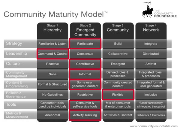
As I make my exit from the University of Denver, I’ve decided to write one last series of posts outlining what I consider the state of social media at the university. To do so, I’d like to use The Community Roundtable’s Community Maturity Model as a starting point. The model is part of the Roundtable’s 2012 State of Community Management report. Below is the model with my determination of where DU sits. One caveat: I’ve ranked DU as a whole in this illustration rather than my department- MarComm- specifically. There’s a lot of variance in terms of social media sophistication across campus, so you may disagree with my overall ranking of DU and that’s OK. It’s probably worth ranking your own unit as a contrasting exercise to what I’ve provided.

My rankings for DU in terms of the community maturity model.

The eight competencies on the Y-axis are the building blocks of a successful social media program. The X-axis contain the maturity stages that organizations go through as their competency increases. Again, some units will rank higher or lower than what I’ve indicated, but as a whole, I’ve placed DU squarely in the “stage 2: emergent community” space.

While DU ought to advance into stage 3 and beyond, it can’t. Our culture of decentralization (endearingly referred to as “the silo effect”) is the root problem (depending on how many onion layers you care to peel). It creates a gulf between stage 2 and 3 which proves difficult for us to cross (and, indeed, most any other siloed organization). While tools and resources like Yammer and the WebEd series of in-person and online workshops were intended to create a mechanism to cross that gulf, they have only achieved limited success, if any. Other initiatives, like the Center for Teaching and Leraning’s video manager tool currently under development and the recently created marketing confab group that pools marketings from across campus together, continually get us closer, but they haven’t yet gotten DU to cross the gulf. So the question is: what will?

To answer that question we ought to ask why we should at all. Clearly, students live and breathe social media, an idea that has (and is) fueling novel ways for people, organizations and information to connect with one another. It provides an opportunity to better connect our community and it’s wealth of knowledge. Yet, DU was late to the game, officially speaking. Without systems, processes and resources for departments to leverage, siloed approaches once again took root with all of it’s associated issues.

As I look back on my 2 year tenure as a social media strategist at DU, I do see a desire across campus, at least on a grass roots level, to create a whole that is greater than the sum of the parts. Of course, differing agendas, incentive structures and many other factors keep grass root efforts at the grass roots level. I believe DU needs to undergo fundamental change in terms of centralization versus decentralization before social media (and the web in general) become a springboard to a better student experience, lower costs, greater efficiencies and a model of DU’s desire to be a great university dedicated to the public good.

I’m very interested in reading and seeing the rankings you create for your own unit or for your own institution. Feel free to add rankings, issues, opportunities and anything else that’s relevant in the comments.

Book Notes: The Inmates Are Running the Asylum

  • Cognitive friction: the resistance encountered by a human intellect when it engages with a complex system of rules that change as the problem changes.
  • “#1 goal of all computer users is to not feel stupid.”
  • Larry Keeley’s three qualities for high tech products:
    1. Capability: what can be done? Supplied by technologists.
    2. Viability: what can we sell? Supplied by business people.
    3. Desirability: what do people want? Supplied by designers.
  • Need and desire are not the same. Desire leads to loyalty.
  • Designing for a minority of users leads to success rather than attempting to accommodate all users. Specificity is key. Find a common denominator and work off of it.
  • Personas are a key to successfully designing a product/service. They must be specific more so than accurate in order for development not to get carried away with edge cases. Don’t average them because that saps the power of specificity. Specificity directs what should and shouldn’t be done in the system. Personas need to reflect users, not buyers or other characters that are close to the product, but not actual users of it.
  • Goals and tasks are not he same. Goals are stable while tasks can change with circumstances yet still achieve the goal.
  • After personas are created and goals outlined, create scenarios. Scenarios should outline user tasks (as uncovered by research and user testing) that achieve goals. You want to eliminate steps to complete tasks and make goal achievement as easy as possible.
  • Two kinds of scenarios: daily use and necessary use. Daily use are most useful and important. They’re the main actions a user performs and also the most frequent. One or two is typical- more than 3 is rare. Users will go from newbie to shortcuts to customization quickly. Necessary use must be performed, but not frequently. Typically more necessary scenarios than daily. Necessary uses don’t require shortcuts or customization since they’re too infrequent for the user. As such, they can safely be less thought through from an interaction perspective.
  • Edge cases can safely be ignored from an interaction standpoint. Include the necessary things needed to do the jobs, but don’t spend much time on them. Edge cases are the place where time and budget can be saved.
  • Less interface and design is better for the end user. An interaction designer’s fingerprints should be nonexistent in the best cases.
  • Inflecting the interface: controls for daily use scenarios should be easily found and used. All other controls for necessary and edge cases can be move to secondary locations.
  • Perpetual intermediaries: the idea that most people will be intermediate level users of a product/service. Beginners are important but people grow out of it quickly. Experts are rare.
  • Ensure vocabulary doesn’t get in the way. Semantics matter. Define things up front so everyone is talking about the same things.
  • Conceptual integrity: from Frederick Brooks, meaning that a single minded vision of a program is the most important ingredient to success.
  • Don’t become a customer driven company doing whatever your customers say to do. Instead, become a vision driven company that allows itself to be informed by customers, but not dictated to by them. Take a longer view of the business, take responsibility, take time and take control.
  • “The central recommendation of this book is that the interaction designer should be the ultimate owner of product quality.

Mastering Difficult Situations

Aside from the ever present issue that decks aren’t nearly as good without the accompanying audio, this is still great advice. And since the audio is missing, I like to add audio in my head as I read the slides. For this one, I chose Marlon Brando’s slow and deliberate pacing that feels nonchalant yet wise and worth your attention. Your mileage may vary on that choice.

Even the Big Boys Can Be Clueless About Social

I came across this interview of two leaders from Nissan’s about their social efforts. I’m left with the impression that they don’t really know what they’re doing. Not yet, anyway. They say that ROI is being figured out, that they think they’re making a solid business case for the investment and that they’re optimistic about the value their efforts will provide in the future. Those don’t sound like reassuring, I-know-what-I’m-talking-about sound bites.

However, I’m not here to poke fun at the speakers. Far from it. We’ve all read the articles about how to measure ROI, how to justify resourcing social efforts, etc. but clearly (at least at this Fortune 500 company), it hasn’t been figured out. If you’re getting heat about social’s importance or impact, you’re in good company. The field is simply too young for normal business processes and understanding. Our tools are being created and evolved as I write and therefore don’t provide consistent nor universal guidelines, metrics, standards, approaches, … anything. All facets of business evolve over time, but not at the pace of social.

Social media is more like the early days of oil. People flooded into that industry causing chaos until enough consolidation took place to bring about order and a semblance of normalcy. We see the same taking place today in the social world as companies merge and leaders begin to rise to the surface. Time will provide us all with “normal” processes, techniques and measures even as innovation continues to push everyone and everything forward. Until then, be confident in your own approach to the field. After all, you might be the one who provides “normal.”

Gerry McGovern & Audience Based Navigation

Gerry McGovern nails it again. In his latest post, he laments audience based navigation. Not always, mind you, but often. One of McGovern’s main examples is from the educational world where audience based navigation is rampant and, in my humble opinion, replete with the problems he cites. The main thing to ensure is mutual exclusivity among audience segments. Otherwise, people don’t know where to go if they find that they fall into multiple categories. I’ve covered this topic in the past and I’m glad McGovern has given it airtime. It’s long overdue for higher ed to, at minimum, treat audience based navigation as a secondary means of exploring a site.

Book Review: The Innovative University

The cover to The Innovative University: Changing the DNA of Higher Education from the Inside Out
Clayton Christensen and Henry Eyring apply Christensen’s disruptive innovation theories to traditional, 4 year, public and private higher ed institutions. It’s a great primer for anyone who wishes to understand the issues currently facing the higher ed world. I’ve written quite a bit at this blog about the issues this book puts into historical context. I’m now much more well grounded as to the origins of the problems I see and how they can be dealt with in the future. Here are a few highlights:

  • Three of Harvard’s successive presidents- Charles Eliot, Lawrence Lowell and James Conant- each contributed to what we now stereotype as a typical university. That model is pursued by many (most?) “traditional” universities and it comes at a high cost.
  • The highly decentralized organizational structure is caused by a desire to provide the best education possible. Its outcome is the creation of specialized graduate schools that sit atop undergraduate programs. Those schools tend to isolate subject matter in order for faculty and students to interact and collaborate to a greater degree. The downside- isolation- squeezes a general purpose, liberal arts type of education as undergrads are more likely to be trained to enter graduate school than to be productive in the working world.
  • The grueling “publish or perish” approach that all would be professors must traverse in order to gain tenure takes away a portion of their time to teach. With research focused faculty incentivized to pursue discovery of the next big idea, they shun teaching low level courses in preference of working with graduate students who can help them advance their scholarly inquiry. Undergraduates suffer from a relative dearth of highly accomplished instructors.
  • Universities do not utilize their infrastructure well which causes overhead expenditures to unnecessarily be large compared with their revenue generation potential. Adding summer terms and using classrooms throughout the day and night would maximize the value of buildings.
  • A “bigger and better” mentality produces many high cost services including athletic programs and new buildings, a desire to hire the best faculty at higher financial and student learning cost, and ever stringent admission selectivity in an attempt to raise the institution’s rankings. All of these practices come at great cost, usually outstripping revenue even as tuition rises considerably faster than inflation. The entire system is unsustainable and requires state and federal largesse along with aggressive fundraising.

The authors spell out many innovative ways to get out of the snowball effect that these issues cause. They use BYU-Idaho as a model institution that has bucked many of the pitfalls that engulfs higher ed today.

If you work at a higher ed institution, this book won’t alleviate the frustrations you most likely feel, but it will give you some context to understand the nature of those frustrations. They’re systemic and not easily solved without major effort from senior management and buy in from employees.

Social Media Starts With Your Own Place

I couldn’t have said it any better. John Battelle talks about social media in a McKinsey interview:

“A lot of companies are saying, ‘If we’re going to do social, then we’re going to build in Facebook.’ They think they can just check the box and cover the majority of their social program by investing in a really good Facebook page. I agree that all brands probably should be on Facebook, but what you really need is an integrated strategy that has – at its root – the brand’s own domain, independent from any platform other than the Internet itself. The best companies create communities of interest that are independent: they are rooted in the independent Web, with expressions on Facebook, or as an iPhone or Android app – those all become instances of their brand. And then companies should create a circulatory system through which they can promote different aspects of their messaging and interactions with their community.

“Declare your own place. Our tagline at Federated Media Publishing is ‘We power the Independent Web,’ and there is clear bias in that statement: independent matters more than dependent. If you build your house just in Facebook, you are dependent upon Facebook. And I think that strategy, if taken alone, is dangerous. I don’t mean that Facebook is dangerous – I think it’s great. But if you’re going to be a brand with a publishing approach to marketing, you must have an independent taproot that isn’t controlled by anyone but you. Then put out your branches and feelers everywhere. Integrate that experience and let your content and messaging flow through it.”

Thoughts on Higher Ed in the Mobile Space

Mobile is on everyone’s mind these days. Many schools have already launched some kind of iteration to meet and compete in the mobile space. But I’m finding the early versions lacking. That’s not meant as a criticism though. All early attempts will be rough around the edges as novelty wears off and best practices begin to form. With that in mind, here are a few thoughts on where things stand.

Don’t conflate audience segments with use cases

I see this all the time in higher ed. A mobile site offers links to content aimed at prospects and also throws in “mobile” functionality like maps and directions. Who are the mobile tools intended for? Prospects are not in need of maps or directions- they’re not on campus. Yes, they are on campus during a visit, but with decision making processes lasting months if not  years, it amounts to a rare occurrence (and you shouldn’t design interfaces for the exception to the rule- offer access to the functionality, but don’t make it a focus). Like any other project, you need to settle on who you’re building your project for OR for what purpose (i.e. use case), but not both. It doesn’t make sense to offer tools that are really meant to fulfill particular use cases alongside content meant to fulfill audience segment needs (unless they’re the same thing in which case we’re only talking semantics). Divide an conquer. Create a single .edu experience with focus and intent. Don’t get mesmerized by “mobile” functionality unless it supports the bigger plan.

Use cases might point you towards an app

If research suggests that maps or other kinds of functionality are needed, don’t be so quick to throw them in alongside the content intended for an audience segment. Instead, be ruthless in your curation and editing of the interface and user flow. Let the focus of your strategy be your guide and allow it to simplify your decisions. If your intent is to primarily reach prospects via mobile, then do so. Take the research finding that don’t fit well (like maps) and set them aside. Once you have the segment’s experience honed, then take all the leftover stuff and ask why it was left out. I think in the case of maps, it will be left out because it’s not directed toward prospects. It’s really intended for an on-campus use case which might mean it’s relevant to a prospect when visiting, but more apt for the people who are always on campus- students, employees. The use case cuts across traditional audiences and presents an opportunity to create a second experience, this time centered around the I’m-on-campus use case.

That use case might best be addressed through a dedicated app. Why? Because mobile doesn’t necessarily mean walking on campus. You can just as easily be sitting at home surfing on your phone. This fact suggests that the mobile site should actually be the same as the desktop site, or, in other words, there should only be one universal .edu experience whether it is seen on a phone, an iPad, a desktop or anything else. This is the responsive web design idea that’s gaining so much attention (and deservedly so). So, if all devices point to the same experience and that experience is determined to primarily be centered around prospects, then where should this use case approach apply? I say an app. It can include links to the intranet, Blackboard (or whichever LMS your institution uses), shuttle service, dining hall push notifications, etc.- anything that matches the use case.

Quick examples

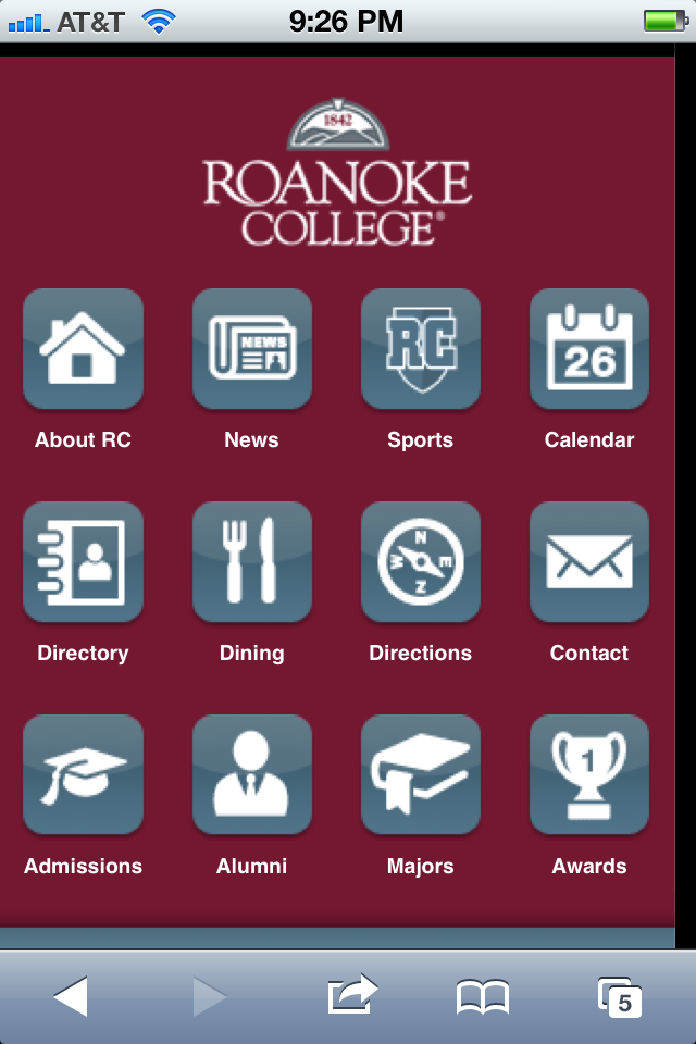
Harvard has done an excellent job of providing focus to their mobile experience. You can tell by the content offered that it’s squarely directed to on-campus use. There is nothing extraneous to that purpose which brings it focus, clarity and cohesiveness. Their website, on the other hand, is squarely directed at prospects. There are ways to get to content that isn’t specifically geared to prospects, but those access points are secondary to the main show which is for prospects. Roanoke’s mobile site, in contrast, has less focus. You might think they follow an on-campus use case strategy too, but then you see that they include links for admissions and majors- content meant for prospects. They also have a link labelled alumni which is yet another audience segment, this time literally called out. In contrast to Harvard, Roanoke’s palette of content is much less coherent burdening the user to figure out whether or not the site is of use to them or not. Placement of the links is also a problem. Josh Clark teaches us that the audience specific links are located at the most accessible link target areas of the screen. That further adds usability confusion to the site.

Harvard's mobile site prioritizes the needs of people on campus.
Harvard's site is geared toward prospective students.
Roanoke's mobile site mashes together content for various audience groups and does so in a way that isn't prioritized.