I was in a fender bender last weekend. An SUV backed up into my Accord denting the hood with its bumper. Question: what’s the point of car bumpers if they don’t meet at a standard height?
Even the Big Boys Can Be Clueless About Social
I came across this interview of two leaders from Nissan’s about their social efforts. I’m left with the impression that they don’t really know what they’re doing. Not yet, anyway. They say that ROI is being figured out, that they think they’re making a solid business case for the investment and that they’re optimistic about the value their efforts will provide in the future. Those don’t sound like reassuring, I-know-what-I’m-talking-about sound bites.
However, I’m not here to poke fun at the speakers. Far from it. We’ve all read the articles about how to measure ROI, how to justify resourcing social efforts, etc. but clearly (at least at this Fortune 500 company), it hasn’t been figured out. If you’re getting heat about social’s importance or impact, you’re in good company. The field is simply too young for normal business processes and understanding. Our tools are being created and evolved as I write and therefore don’t provide consistent nor universal guidelines, metrics, standards, approaches, … anything. All facets of business evolve over time, but not at the pace of social.
Social media is more like the early days of oil. People flooded into that industry causing chaos until enough consolidation took place to bring about order and a semblance of normalcy. We see the same taking place today in the social world as companies merge and leaders begin to rise to the surface. Time will provide us all with “normal” processes, techniques and measures even as innovation continues to push everyone and everything forward. Until then, be confident in your own approach to the field. After all, you might be the one who provides “normal.”
Gerry McGovern & Audience Based Navigation
Gerry McGovern nails it again. In his latest post, he laments audience based navigation. Not always, mind you, but often. One of McGovern’s main examples is from the educational world where audience based navigation is rampant and, in my humble opinion, replete with the problems he cites. The main thing to ensure is mutual exclusivity among audience segments. Otherwise, people don’t know where to go if they find that they fall into multiple categories. I’ve covered this topic in the past and I’m glad McGovern has given it airtime. It’s long overdue for higher ed to, at minimum, treat audience based navigation as a secondary means of exploring a site.
Book Review: The Innovative University

Clayton Christensen and Henry Eyring apply Christensen’s disruptive innovation theories to traditional, 4 year, public and private higher ed institutions. It’s a great primer for anyone who wishes to understand the issues currently facing the higher ed world. I’ve written quite a bit at this blog about the issues this book puts into historical context. I’m now much more well grounded as to the origins of the problems I see and how they can be dealt with in the future. Here are a few highlights:
- Three of Harvard’s successive presidents- Charles Eliot, Lawrence Lowell and James Conant- each contributed to what we now stereotype as a typical university. That model is pursued by many (most?) “traditional” universities and it comes at a high cost.
- The highly decentralized organizational structure is caused by a desire to provide the best education possible. Its outcome is the creation of specialized graduate schools that sit atop undergraduate programs. Those schools tend to isolate subject matter in order for faculty and students to interact and collaborate to a greater degree. The downside- isolation- squeezes a general purpose, liberal arts type of education as undergrads are more likely to be trained to enter graduate school than to be productive in the working world.
- The grueling “publish or perish” approach that all would be professors must traverse in order to gain tenure takes away a portion of their time to teach. With research focused faculty incentivized to pursue discovery of the next big idea, they shun teaching low level courses in preference of working with graduate students who can help them advance their scholarly inquiry. Undergraduates suffer from a relative dearth of highly accomplished instructors.
- Universities do not utilize their infrastructure well which causes overhead expenditures to unnecessarily be large compared with their revenue generation potential. Adding summer terms and using classrooms throughout the day and night would maximize the value of buildings.
- A “bigger and better” mentality produces many high cost services including athletic programs and new buildings, a desire to hire the best faculty at higher financial and student learning cost, and ever stringent admission selectivity in an attempt to raise the institution’s rankings. All of these practices come at great cost, usually outstripping revenue even as tuition rises considerably faster than inflation. The entire system is unsustainable and requires state and federal largesse along with aggressive fundraising.
The authors spell out many innovative ways to get out of the snowball effect that these issues cause. They use BYU-Idaho as a model institution that has bucked many of the pitfalls that engulfs higher ed today.
If you work at a higher ed institution, this book won’t alleviate the frustrations you most likely feel, but it will give you some context to understand the nature of those frustrations. They’re systemic and not easily solved without major effort from senior management and buy in from employees.
Social Media Starts With Your Own Place
I couldn’t have said it any better. John Battelle talks about social media in a McKinsey interview:
“A lot of companies are saying, ‘If we’re going to do social, then we’re going to build in Facebook.’ They think they can just check the box and cover the majority of their social program by investing in a really good Facebook page. I agree that all brands probably should be on Facebook, but what you really need is an integrated strategy that has – at its root – the brand’s own domain, independent from any platform other than the Internet itself. The best companies create communities of interest that are independent: they are rooted in the independent Web, with expressions on Facebook, or as an iPhone or Android app – those all become instances of their brand. And then companies should create a circulatory system through which they can promote different aspects of their messaging and interactions with their community.
“Declare your own place. Our tagline at Federated Media Publishing is ‘We power the Independent Web,’ and there is clear bias in that statement: independent matters more than dependent. If you build your house just in Facebook, you are dependent upon Facebook. And I think that strategy, if taken alone, is dangerous. I don’t mean that Facebook is dangerous – I think it’s great. But if you’re going to be a brand with a publishing approach to marketing, you must have an independent taproot that isn’t controlled by anyone but you. Then put out your branches and feelers everywhere. Integrate that experience and let your content and messaging flow through it.”
Thoughts on Higher Ed in the Mobile Space
Mobile is on everyone’s mind these days. Many schools have already launched some kind of iteration to meet and compete in the mobile space. But I’m finding the early versions lacking. That’s not meant as a criticism though. All early attempts will be rough around the edges as novelty wears off and best practices begin to form. With that in mind, here are a few thoughts on where things stand.
Don’t conflate audience segments with use cases
I see this all the time in higher ed. A mobile site offers links to content aimed at prospects and also throws in “mobile” functionality like maps and directions. Who are the mobile tools intended for? Prospects are not in need of maps or directions- they’re not on campus. Yes, they are on campus during a visit, but with decision making processes lasting months if not years, it amounts to a rare occurrence (and you shouldn’t design interfaces for the exception to the rule- offer access to the functionality, but don’t make it a focus). Like any other project, you need to settle on who you’re building your project for OR for what purpose (i.e. use case), but not both. It doesn’t make sense to offer tools that are really meant to fulfill particular use cases alongside content meant to fulfill audience segment needs (unless they’re the same thing in which case we’re only talking semantics). Divide an conquer. Create a single .edu experience with focus and intent. Don’t get mesmerized by “mobile” functionality unless it supports the bigger plan.
Use cases might point you towards an app
If research suggests that maps or other kinds of functionality are needed, don’t be so quick to throw them in alongside the content intended for an audience segment. Instead, be ruthless in your curation and editing of the interface and user flow. Let the focus of your strategy be your guide and allow it to simplify your decisions. If your intent is to primarily reach prospects via mobile, then do so. Take the research finding that don’t fit well (like maps) and set them aside. Once you have the segment’s experience honed, then take all the leftover stuff and ask why it was left out. I think in the case of maps, it will be left out because it’s not directed toward prospects. It’s really intended for an on-campus use case which might mean it’s relevant to a prospect when visiting, but more apt for the people who are always on campus- students, employees. The use case cuts across traditional audiences and presents an opportunity to create a second experience, this time centered around the I’m-on-campus use case.
That use case might best be addressed through a dedicated app. Why? Because mobile doesn’t necessarily mean walking on campus. You can just as easily be sitting at home surfing on your phone. This fact suggests that the mobile site should actually be the same as the desktop site, or, in other words, there should only be one universal .edu experience whether it is seen on a phone, an iPad, a desktop or anything else. This is the responsive web design idea that’s gaining so much attention (and deservedly so). So, if all devices point to the same experience and that experience is determined to primarily be centered around prospects, then where should this use case approach apply? I say an app. It can include links to the intranet, Blackboard (or whichever LMS your institution uses), shuttle service, dining hall push notifications, etc.- anything that matches the use case.
Quick examples
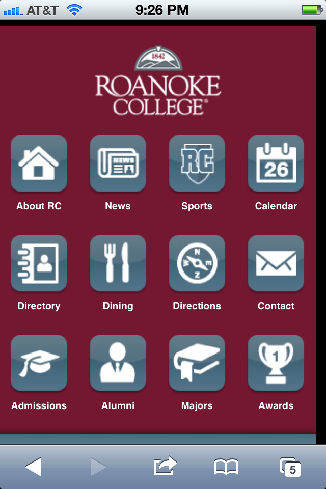
Harvard has done an excellent job of providing focus to their mobile experience. You can tell by the content offered that it’s squarely directed to on-campus use. There is nothing extraneous to that purpose which brings it focus, clarity and cohesiveness. Their website, on the other hand, is squarely directed at prospects. There are ways to get to content that isn’t specifically geared to prospects, but those access points are secondary to the main show which is for prospects. Roanoke’s mobile site, in contrast, has less focus. You might think they follow an on-campus use case strategy too, but then you see that they include links for admissions and majors- content meant for prospects. They also have a link labelled alumni which is yet another audience segment, this time literally called out. In contrast to Harvard, Roanoke’s palette of content is much less coherent burdening the user to figure out whether or not the site is of use to them or not. Placement of the links is also a problem. Josh Clark teaches us that the audience specific links are located at the most accessible link target areas of the screen. That further adds usability confusion to the site.


Thoughts on Audience Segmentation Via Clayton Christensen’s Theories
In the past, I’ve written about the line that exists between audience segmentation versus fragmentation. In it, I pondered whether our institution’s landscape of nearly 300 social media accounts constituted good segmentation or out-of-control fragmentation. Since that June 2011 post, I’ve been doing a deep dive into Clayton Christensen’s work. He discusses how well intentioned, smart people can wind up with erroneous conclusions and poor results through the use of traditional audience segmentation practices (i.e. demographics) when it comes to innovation. Why? Because it typically only leads to incremental advances, squeezing out a bit more success where small pockets of opportunity might still be found. To make leapfrog advances, however, requires a different approach. Christensen’s work deals with disruptive innovation, but I believe aspects of his work can readily be applied to marketing in the higher ed world. One of his main ideas goes something like this: it’s a customer’s circumstances that should drive your efforts, not the actual customers themselves. You should ask yourself the question “What job is the customer hiring this product/service to do for them?” rather than “How can we use the data we know about the customer to entice them to use this product/service.”
In higher ed, we ask the latter question based on the segments we all know well: prospects, students, alumni, donors, parents, faculty, etc. The problem with this approach is that it’s too far removed from what our audiences need to get done. We segment this way based on what we want them to do, not necessarily by what they need to do. The gap that exists between the two is where you’ll find ineffective marketing.
In alumni relations, for example, we work hard to get people to engage with the institution through events, social media, etc. What that approach misses, however, is the fact that many of our alums don’t want to engage with us. It’s nothing personal, they just don’t. Yet, we shower them with as much marketing and programming as we can only to find that the efforts end poorly. Additionally, some who do participate will only do so because there is a temporary alignment of goals: we offer free food at a sporting event and an alum, who planned to attend anyway, decides to “participate” in order to get the free food. We mark that down as engagement, but it isn’t- at least not in the way we intended.
Let’s now take a Christensen approach and ask “What job is a member of the university community trying to get done?” Search for a job is sure to be top of mind, but what else? How about work/life balance, support for entrepreneurial start-ups and better time management skill? Seen this way, we find that these jobs aren’t limited to what we label “alumni.” Alumni may indeed list finding a job a top priority, but so would many other traditional audience segments. We see this with any set of jobs needing to be done. Parents grapple with work/life balance, students start businesses and everyone could probably benefit from better time management. We find that our traditional methods of segmentation are too one dimensional and place people in buckets that may not reflect who those people really are. In turn, they won’t provide a good foundation for programming and marketing success. If we simplify a group like alumni that are, in reality, exceptionally diverse, we end up creating and promoting programming and marketing that are one size fits none. Everybody loses.
So why does higher ed lump people in marginally meaningful ways? It’s likely because that’s how our internal systems, organization and data are aligned. As students graduate, they are deleted from the student bucket and placed into the alumni bucket and, hopefully, handed off to the alumni relations group for further engagement. Unless your institution has a sophisticated CRM tool that actively tracks the right sorts of data, then you can’t segment based on anything more meaningful. Unless fundamental change occurs, higher ed will be unable to think about it’s audiences based on their needs rather than their superficial characteristics.
This is very similar to the user experience field which wants to be “customer focused” by addressing people’s needs and wants. Needs and wants are uncovered through research and then tested against as the experience being built is created. This same approach is analogous to what Christensen advocates. To be truly successful requires us to uncover our audiences’ needs and create programming and marketing that specifically addresses them. That will require us to avoid grouping people in our traditional ways.
If you’re interested in learning more about Christensen, here’s a great starter video that gives an overview of his theories. Highly recommended, of course.
Google Maps Frustration
If you search for our university on Google maps you’ll find a listing for a liquor store right in the middle of campus (which isn’t correct, of course). So, what’s a person to do? Report the problem to Google, right? Right. Well, good luck. I didn’t see an obvious way to submit an issue, so I went to the help link and did a search. I ended up a Google help article describing how to report a problem. Let’s count the problems with this process, shall we?
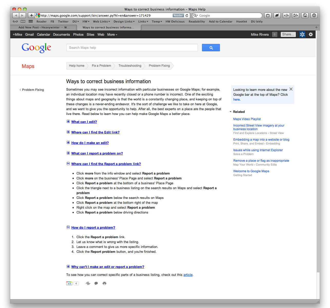

- Most obvious, is that there is no obvious way to report a problem when you’re in the maps area. It’s an outlier use case, I’ll grant you that, but still, it’s not carte blanche to hide it. The most logical place to go then is the help link.
- The help article has a “how do I report a problem” toggle. Perfect! This is exactly what I need. Wel,, hangon a second. It mentions a “report a problem” link, but fail to actually provide the link. They instead choose to talk about it. Hello? This is the web, right?
- Given the above oversight, I decide to open the “where can I find the report a problem link” toggle (which wouldn’t be necessary if they simple gave the link in question). It instructs to click “more” from the info window. What’s the window info, you ask? Who the hell knows? Figure it out for yourself.
- As I ponder what they might mean by info window, I see a “more” link in the top black bar- maybe that’s what they mean by the info window? Doesn’t seem like an info window, but OK, I’ll try it. Nope. That only shows all the various Google product links, no “report a problem” to be found there.
- OK, the info window must be within Google maps then. Ha! Silly me, of course! I should have looked in the maps area all along. User error, my bad. I go back to the problematic map and bingo, I spot the more link right there in the left sidebar, er… info window. Why is the left column called an info window? That’s not my definition of a window, nor anyone else’s I suspect, but hey, details. Why quibble now, I’m so close to successfully achieving my issue submittal.
- I open the “more” pulldown menu, but alas, the report a problem link is greyed out. What gives? Why show functionality when you can’t actually use it? At this point, I’m thinking to myself “Holy crap! I have got to blog about this.”
- My last ditch effort is to click on the offending liquor-store-in-the-middle-of-campus pop-up to see if I can report the problem there (maybe that’s what they mean by an info window?). Indeed, the pop-up also has a more pulldown with a functioning report a problem link.
- The problem report asks me some questions in order to route and solve the issue, but the last bit of information they ask for is to let them know the correct market placement for the liquor store. I was nice in my reply since I’d like the problem corrected, but seriously, they want help in placing the marker correctly? How about using the address they already have listed for the store which is in a different city altogether? It boggles the mind.
Risk Taking in Education
The Washington Post’s Michelle Williams interviews Eric Ries, entrepreneur and author of “The Lean Startup.” In this clip, Ries discusses how the U.S. education system is failing students by not rewarding risk-taking.
The Perfect Higher Ed Layout?
I decided to head over to eduStyle to check out all the site redesign submissions I’ve missed over the last few months. It turns out that “differentiation” doesn’t seem to be a marketing objective anymore. Check out all these variation on a theme (and there are plenty more I could have chosen). What gives? Have we as an industry actually hit upon higher ed’s perfect website layout- big image/interactive area across top with multiple columns of text and images below?
